Work / UX/UI / Vertiv Insights
Vertiv Insights
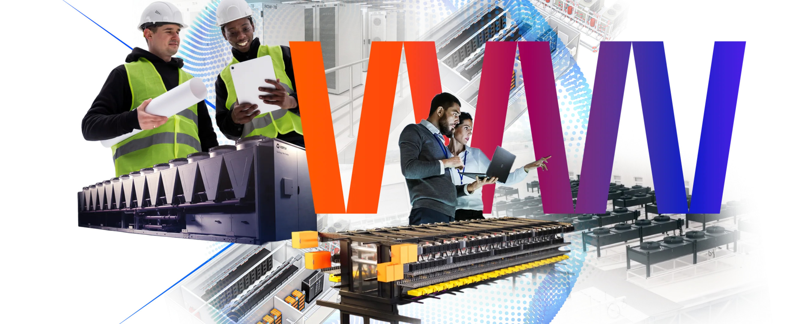
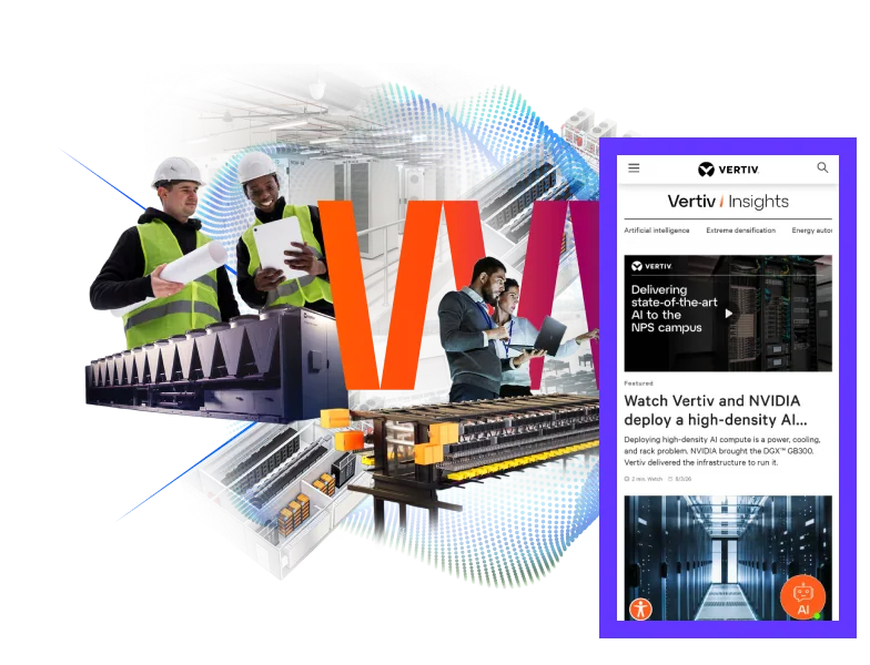
One home for a global data-center leader’s news, resources and case studies – designed for engineers who skim, not browse.
Client
Vertiv
My role
Lead UX/UI Designer
Team
2 designers, 4 devs, 1 PM
Timeline
4 months
Deliverables
IA · Wireframes · UI · Component library
Tools
Figma · Asana · Claude AI
TL;DR – the 30-second version
TL;DR
01 – The problem
News, resources and case studies were scattered across the site. Engineers couldn’t find proof fast enough to bring Vertiv into a deal.
02 – What I did
Led UX end-to-end: content audit, IA, wireframes, high-fidelity UI and a component library the dev team shipped on.
03 – The result
+64%
Organic traffic to Insights in the first six months
(01) – The challenge
Great content. Nobody could find it.
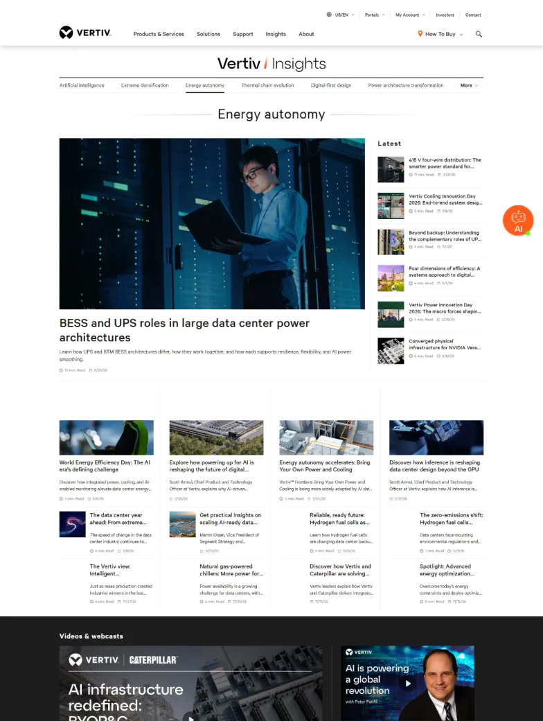
Vertiv publishes a steady stream of industry news, white papers and customer stories – but they lived in different corners of the site, each with its own template. Sales teams were emailing PDFs because the website couldn’t do the job.
The brief: build a single, scalable “Insights” destination that serves busy engineers first, ranks well in search, and gives marketing a system they can publish into without calling a designer.
“If an engineer can’t find the proof in two clicks, the content doesn’t exist.”
— Vertiv Project Lead
(02) – Process
How it came together
01
Discover
Content audit, analytics and stakeholder interviews to find what engineers actually searched for.
02
Structure
A topic-first IA: industries, technologies and content types that cross-link instead of silo.
03
Wireframe
Low-fi flows for hub, article, resource and case study pages, tested with sales and marketing.
04
Design system
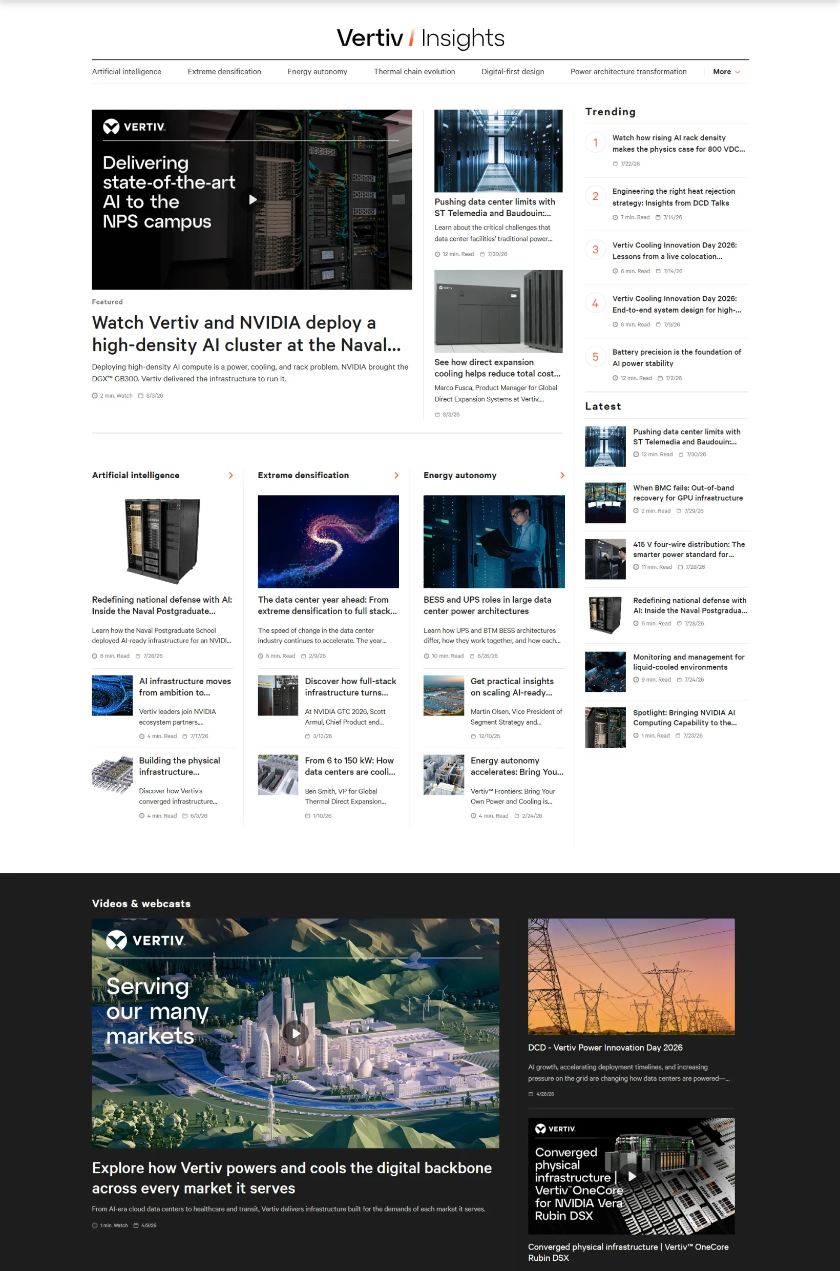
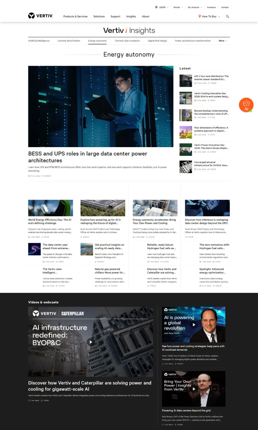
High-fidelity UI built as a component library – cards, filters, article modules, CTAs.
05
Hand-off
Specs, tokens and QA with the dev team through launch, plus a publishing guide for marketing.
Where AI helped
Research into best practices and overviews of various editorial and news resource channels combined with wireframe design.
(03) – The work
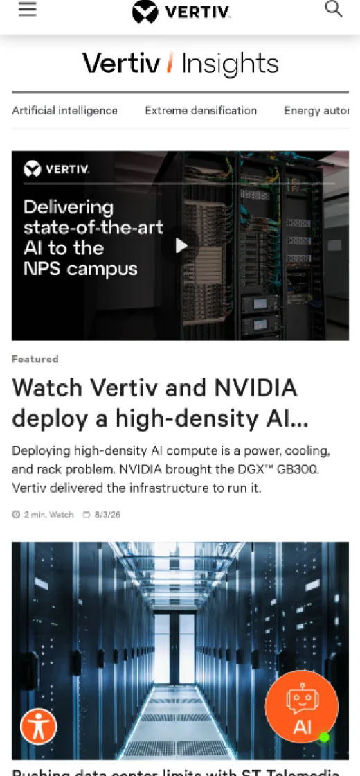
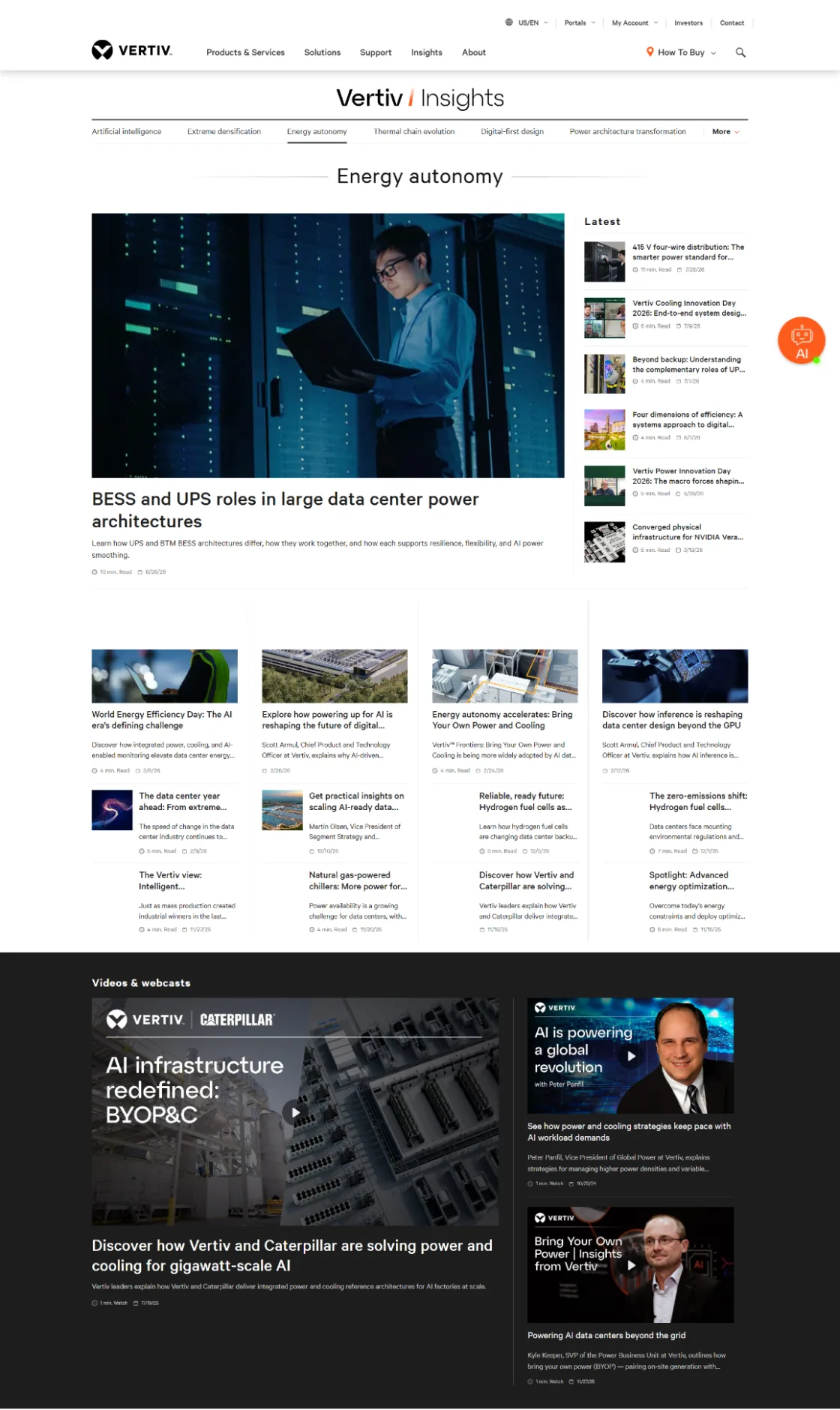
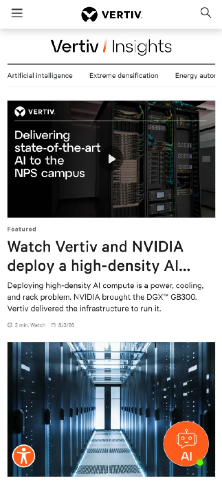
Hub, article, mobile.

(04) – Results
What changed
+64%
Organic traffic to Insights
2:48
Avg. time on article (B2B avg. ≈ 1:37)
140
Pieces published in year one
(05) – If I did it again
What I’d do next
Personalise the hub by role – facility manager, IT lead, engineer – and measure which content actually starts sales conversations, not just page views.
Credits: D3 / in-house team · Freelance UI/UX Partners
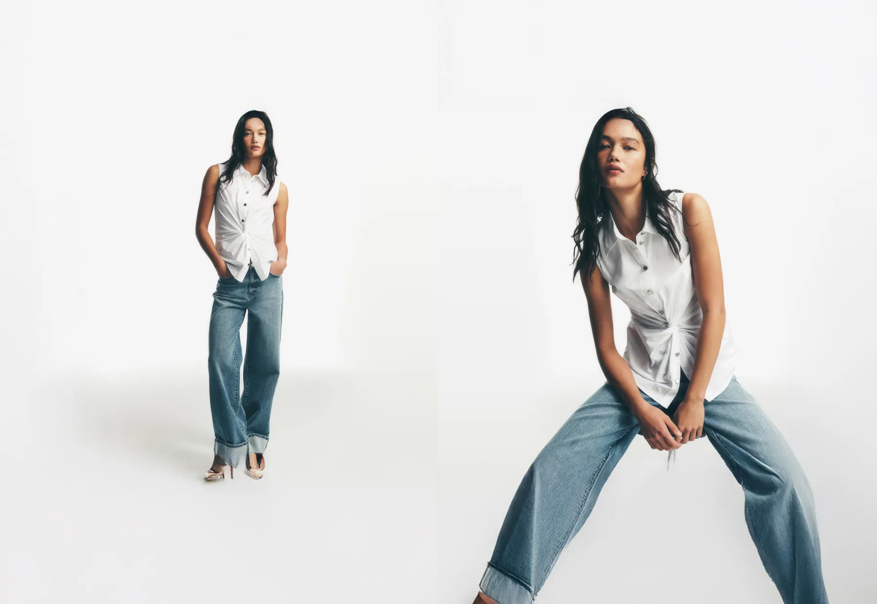
Next case study
DKNY →
(05) – Contact
Say hi
Hiring a Senior Art Director or Design Lead?
I’m open to full-time and contract roles – in-house or agency. Send the brief, the team and the problem; I’ll come back with questions and ideas.
mk@workingprint.com
Based in
NYC · Remote / Hybrid